projects
Gistelink
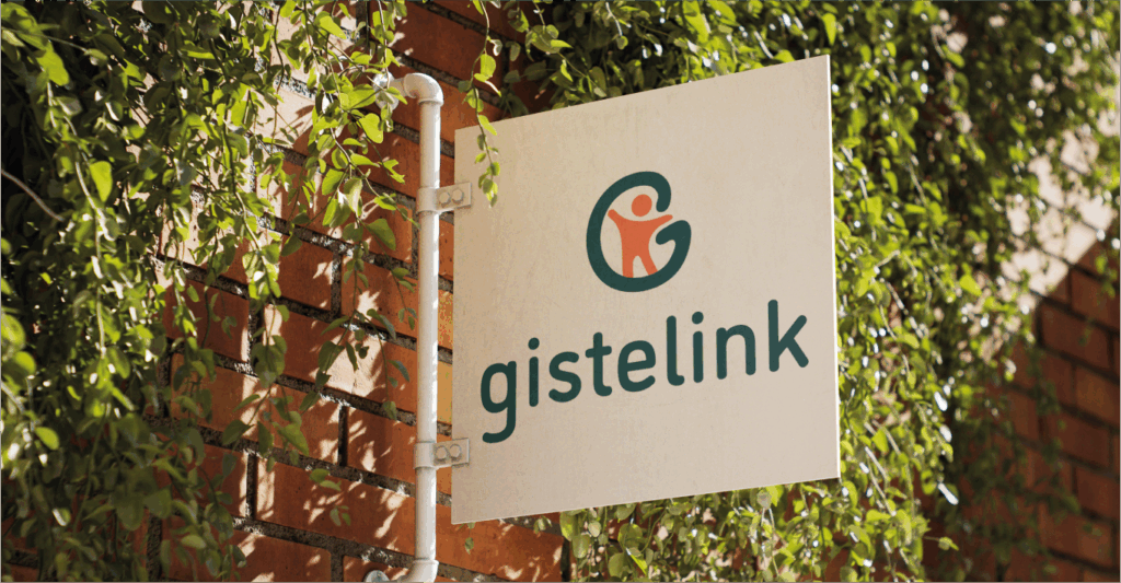
Gistelink WARMTH- CONNECTION – RELIABILITY These were the three core values that shaped the logo design for Gistelink. The design started from a simple yet powerful symbol: a small figure representing the people we bring together.This figure is placed inside the letter G — referring not only to Gistelink and Gistel, but also to a circle, the universal symbol of connection. In this way, everything comes full circle: the human at the center, surrounded by warmth, reliability, and the continuous flow of connection that defines Gietelink. Go back
Bijenbrouwerij
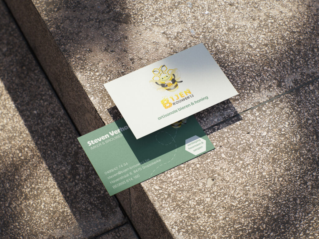
bijenbrouwerij ECO FRIENDLY- PEACE – NATURE These were the keywords for this project.For the Bijenbrouwerij, I drew my inspiration from the logo and poster that had previously been designed for the brand. From there, I developed the business cards, keeping the natural and calm atmosphere intact while subtly carrying through the eco-friendly values. This way, the visual identity stays consistent and highlights the strong connection between the brewery and nature. Go back
Vrij Werk
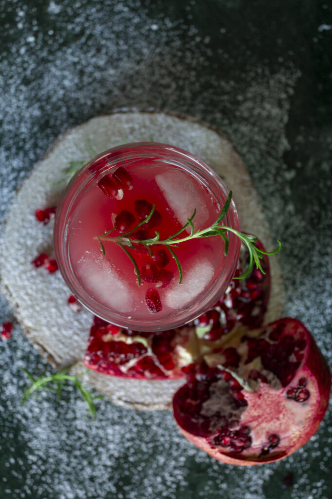
vrij werk COZY – COLORFUL – DAYLIGHT For this personal project, I explored different ways of capturing a single cocktail: a festive pomegranate and gin Christmas drink. I focused on using natural light and experimented with various compositions to highlight the drink’s seasonal character and vibrant color. Go back
Bloedband
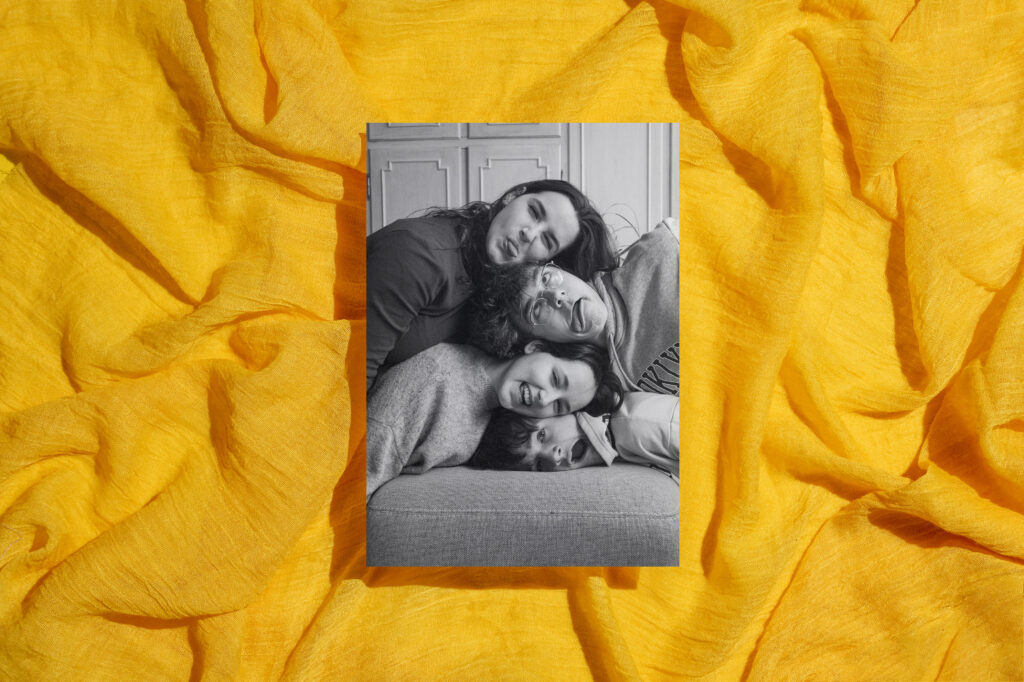
Bloedband FRESH – COLORFUL – ADVENTUROUS These were the keywords for this project.It all started with a sun — a symbol of energy and creativity. Surrounded by drawing tools, it represented the beginning of the design process. As the concept evolved, the sun shifted into a setting sun, or a blooming flow-form — echoing movement and transformation. Inspired by Art Deco, the shapes became more rhythmic and bold. Go back
Studio plien
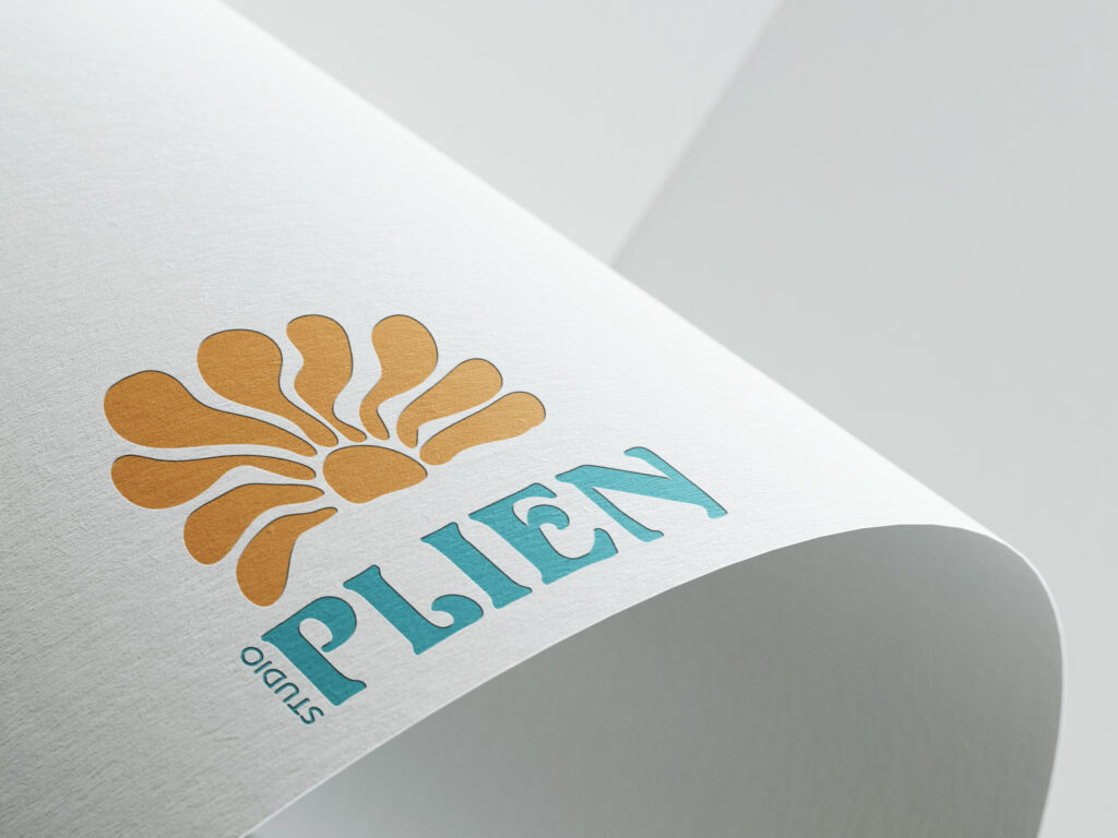
Studio plien FRESH – COLORFUL – ADVENTUROUS These were the keywords for this project.It all started with a sun — a symbol of energy and creativity. Surrounded by drawing tools, it represented the beginning of the design process. As the concept evolved, the sun shifted into a setting sun, or a blooming flow-form — echoing movement and transformation. Inspired by Art Deco, the shapes became more rhythmic and bold. Go back
Moohoo
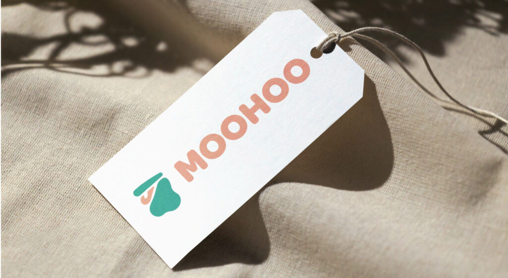
Moohoo COZY – RURAL – PLAYFUL For moohoo I took inspiration from farm elements to base myself on. My logo for moohoo consists of a milk spot and a milk jug from the past. I also chose soft but colorful colors to bring in the rural and nature Go back
Arboria
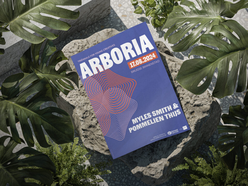
Arboria MAGICAL- PEACE – NATURE These were the keywords for this project.For Arboria I got my inspiration during the triennial walk in Bruges. I started from a wooden construction and linked back to the tree. I didn’t want to choose something too obvious to inspire me, so I went for the annual rings and not the bark of a tree. Go back